There are many indicators of how much slack is appropriate in monetary policy. The plot below illustrates the behaviour of property prices in Canada since the beginning of 2001. Again the impact of the financial crisis/recession is clear. Since then, housing prices have risen steadily in spite of the use of so-called "macro-prudential" instruments by the Finance department.
Source: BIS, http://www.bis.org/statistics/pp.htm
Source: CANSIM II series v122746, v122707, and v498074, and author’s calculations.

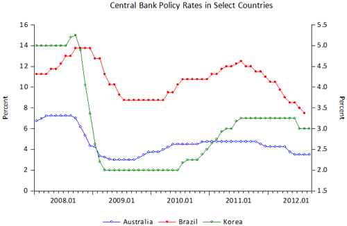
Whether economies largely escaped from the crisis (e.g., Australia, Brazil) or were directly affected by the financial crisis (Korea), they have all begun to reduce their policy rates as shown below. On October 2nd, the Reserve Bank of Australia lowered its policy rate again. It is useful to note that the RBA, like the other central banks shown below, has considerably more room to manoeuvre before it reaches the zero lower bound (ZLB). Clearly, economic prospects, and not just inflation, are seen as deteriorating. Alternatively, as has been mentioned above, central banks are creating spillovers in their attempt to use loose monetary policy to buy time until the sovereign debt crisis, and fears of low economic growth for the foreseeable future, pass.
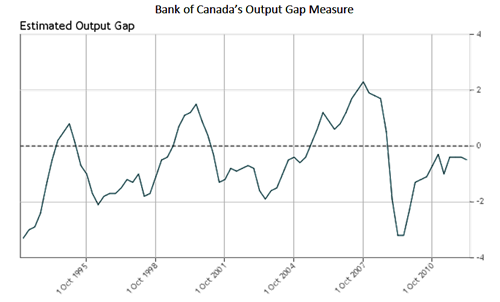
In Canada’s case, there are two reasons to be worried over the near term prospects for economic activity in Canada. As shown below, the Bank of Canada’s own estimates of the output gap remain negative. Perhaps more importantly, the Bank’s estimate of potential real GDP has suffered a noticeable decline that shows no signs of being reversed (not shown). In other words, the path of economic growth the Canadian economy seems to be following is getting further and further away from the world we knew back before the global financial crisis. If we believe that the long-run path of economic growth in Canada ought to return to something approaching what the economy was capable of generating in 2008, then the effective output gap shown below is actually an underestimate.
Source: International Monetary Fund, International Financial Statistics CD-ROM, August 2012
Another way of seeing how all of these forces are affecting the Canadian economy is by examining the Bank of Canada’s Financial Conditions Index (FCI). The most recent data (as of September 25, 2012) is plotted below.
Source: http://credit.bank-banque-canada.ca/financialconditions. Based on weekly data.
Month/day/year plotted in the figure.
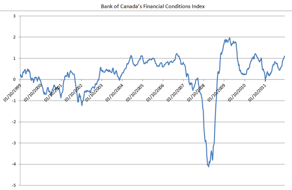
As the Bank points out, “Downward movements in the FCI capture tighter financial conditions, which are therefore consistent with weaker economic activity; upward movements represent improving financial conditions, which would be consistent with stronger economic activity.” Overall then, over the past year, financial conditions appear to have improved and this would appear to suggest that economic conditions will also improve. Indeed, the index is almost at the same level it reached back in 2007, just before the financial shock that is now dubbed the "global financial crisis."